8 Tips to Upgrade Your WordPress Website’s UX
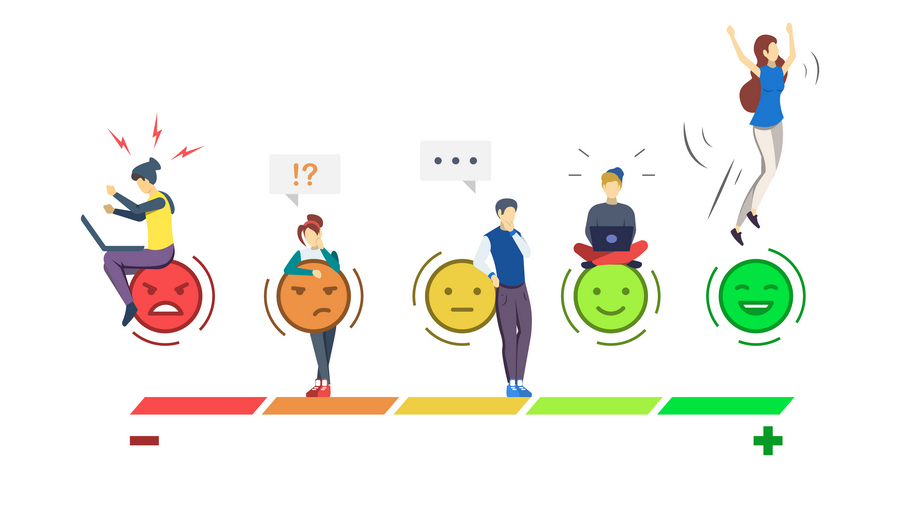
At some point or another, we all experienced lousy user experience (UX). Whether you’re a content creator, web designer, eCommerce specialist, or most importantly, the end-user, we can all agree that subpar UX is the most frustrating feeling ever.
For that reason, we decided to address the common ground where most of the bad UX originates from – the WordPress Website.
Before we start, what is UX exactly?
User experience (UX) represents the user’s emotions and specific viewpoints when using a particular website, app, product, etc. It is based on a myriad of observations and emotive aspects of the human-oriented relationship.
Without further ado, here are eight tips to enhance your WordPress website experience
Perform A UX Research
UX research is the key factor on the road to successful website design. First, you need to know what to analyze, how to properly conduct your research, and apply your insights.
Let’s say you do not feel comfortable doing this on your own, well, you can always seek expert advice, for performing proven UX research techniques. There are web design professionals that can aid you with any KPI you set. They can examine the entire website and provide you with appropriate estimates and critical feedback.
On the other hand, knowing concurrent industry trends, it is advisable to conduct market research and field study, observing user behavior patterns on your website. You’ll gain deeper insights into everyday problems and pain points they face, resolving them accordingly.
After gaining enough information about your target audience, you can test the website’s usability on a specific customer type.
Keep the Design Simple and Intuitive
There is no formula for bulletproof, 100% perfect design, but there are only two golden rules to follow:
- People come first, the design comes after
- Functional beats pretty
What do we mean by that?
Users want simplicity. Bombarding them with oversaturated, clustered design pirouettes will only confuse them and make them leave. Sometimes web designers tend to concern themselves with “artistic integrity,” which often leads them astray.
Web design, by its very nature, should be predictable. People expect to see certain elements in specific places throughout pages. When they don’t… Well, it’s bad news.
They feel most comfortable when they can effortlessly navigate the website. User interface (UI) MUST be simple, sleek, and, above all, easy to understand. Follow a 3-click rule: if they cannot find what they seek in three clicks – they will leave.
Appeal to their previous experiences when they navigate your website by employing familiar concepts, design and copy elements. You can enhance familiarity with subtle (or not so subtle) visual cues.
Visual hierarchy is the first step. Take this blog, for example. You have the headline as primary information, sub-headers as secondary and the text you’re currently reading as tertiary.
Secondly, by using white space, contrasting colors, and bold and large fonts, you subconsciously inform your users of the most important information on the page layout and the predictability of actions they take.
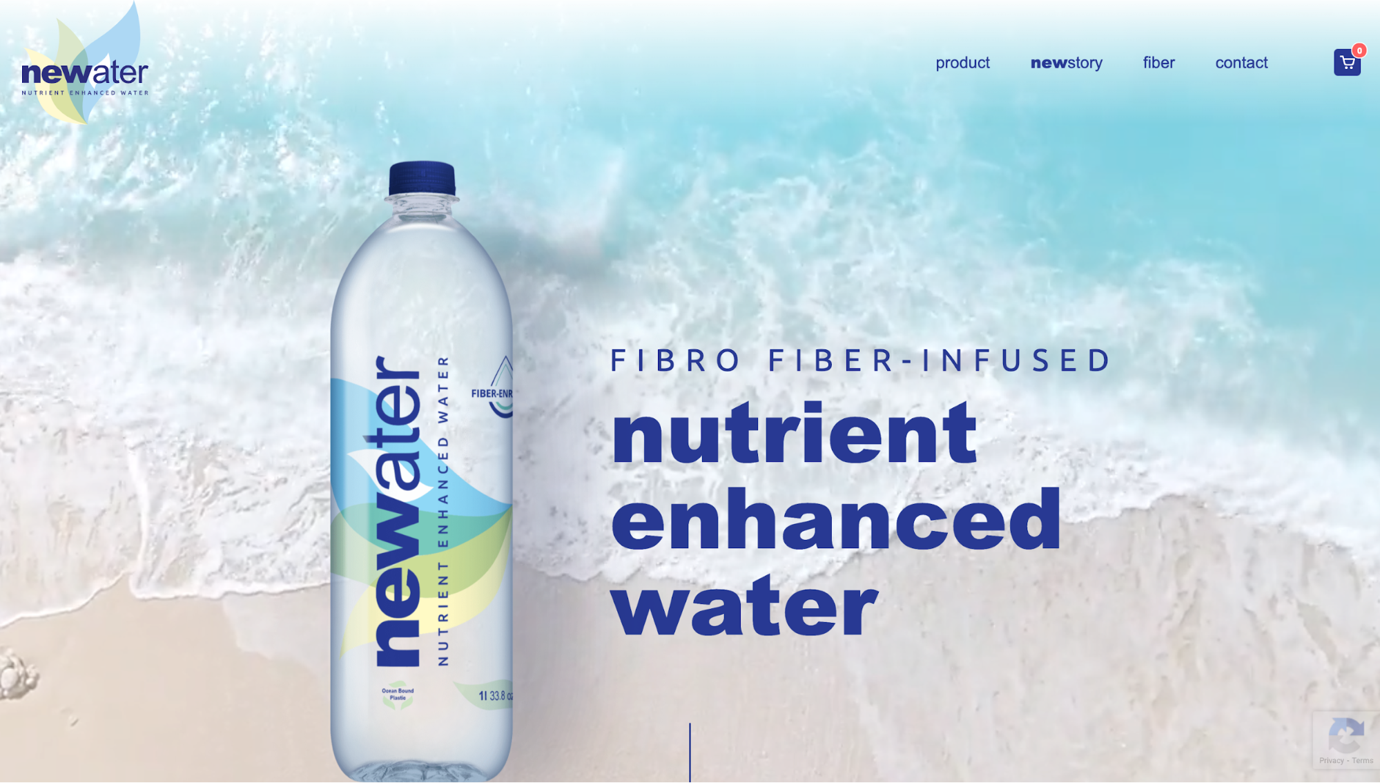
Newater – clean, simple, intuitive, eye-pleasing…
Design for Mobile-friendliness
Responsive design is the concept of restructuring a website in order to naturally refit it for any screen size so it can look great on every device. For a WordPress website, chances are the mobile experience is already decent. However, if it can be enhanced, always optimize for the better.
Use a Sticky Search. Search is the most important element of the mobile experience (and usually the greatest foe of our thumbs). If the users want to access a subcategory quickly, the search option MUST always be visible in your sticky menu.
Focus on the essential elements. Prioritize content by putting the most important information and CTAs at the top of the page.
For an ideal mobile UX, keep your online forms short and sweet. Remove nonessential information and minimize the number of fields the user needs to fill in.
Lastly, for the love of everything sacred – Make your buttons thumb-friendly and make them reachable with appropriate spacing between.
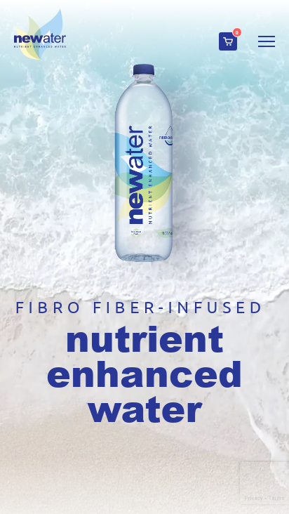
…and mobile-friendly
Boost the Website’s Loading Speeds
What is more annoying than pointless waiting?
Load speed can make or break a website. It is an essential SEO ranking factor, as it directly affects UX. In fact, one in four visitors says that they would abandon a website completely if it takes more than four seconds to load. Remember, 2-3 seconds are optimal; every additional second increases the bounce rate significantly.
Almost 50% of users never revisit poorly performing websites. The best way to boost performance speed is a simple redesign, so let’s add another golden rule: less is more!
Don’t overdesign, as giant eye-pleasing elements only hinder you on the way to success. Minimize all of the features that increase your load time (High-resolution images, complex animations, etc.) and remove all unused media and poorly performing pages.
The quickest way to properly diagnose your website is a quick visit to a doctor know as Google PageSpeed Insights. This online tool analyzes the content of a web page then generates various suggestions to make it faster. Google is now analyzing website performance and UX based on the Core Web Vitals concept. The metrics that make up Core Web Vitals will evolve over time. The current set for 2020 focuses on three aspects of the user experience—loading, interactivity, and visual stability—and includes the following metrics (and their respective thresholds):
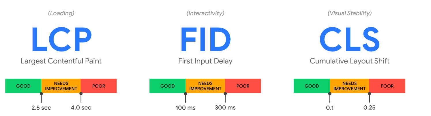
Source: https://web.dev/vitals/
Streamline the Navigation Menu
Website navigation should be obvious and effortless. Every action users take should be done in as few steps as possible. Present them with navigational elements that streamline that journey, such as:
- Navigational bar (goes without saying)
- Categories and subcategories in your sidebar
- Search menu/box
- Internal links
The standard WordPress menu is not bad by any means, but it is limited. If you want to stand out, you can use its powerful Custom Menus feature to arrange and name every key page. Some of the more standard ones are:
- Fixed Position Menu
- Sliding Hamburger Menu
- Card or Grid Menu
Choose the one that best suits your niche but remember to keep menu items and categories to a bare minimum and sort them according to users’ expectations. They want to put as little effort as possible.
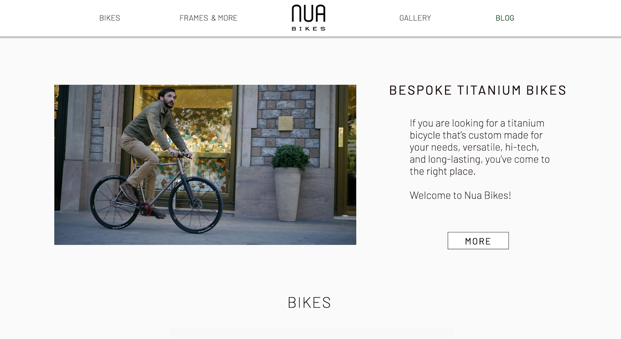
NUA bikes uses minimalistic, predictive and highly effective navigation
Utilize Effective and Attractive Call-to-Action Buttons
Your CTAs need to be accessible and clearly visible on every page of your website. They help you increase your conversion rate, but with a few tweaks, they also add to the overall UX.
It doesn’t matter what your website is about; your CTAs must be clear. It is where you want to guide your visitors’ attention first thing they land on the page.
If you place them strategically and prominently (properly aligned with the rest of your page elements), users will notice them at first glance.
A successful, high-converting CTA has a couple of characteristics:
- It’s designed to look like a button
- It uses contrasting colors
- It has a compelling copy
- It uses first-person
- It’s super specific
- It’s well placed on the page
However, developing a successful CTA requires knowledge of what works for your specific target audience and what works for you. Going back to the first tip is always a sound plan, especially if you’re willing to experiment.
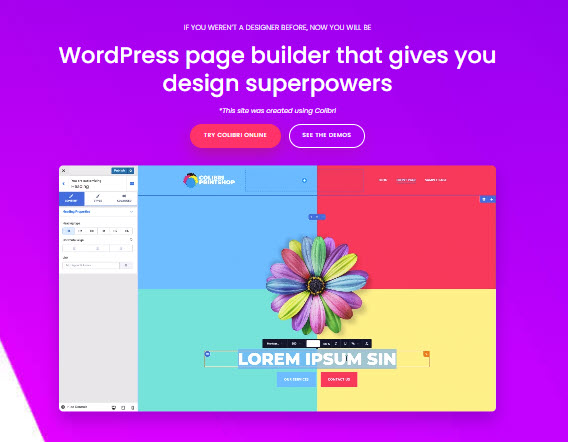
Colibri (WordPress website builder) perfectly emphasized their CTAs within the page design
Leverage Concise and Effective Messaging
The main point of website copy is conveying effective messaging the audience easily understands and remembers. You need bite-sized summations that properly articulate who you are, what you do, why you do it, and most importantly – what is your unique value proposition (UVP).
Remember the 4Cs: You need to be clear, concise, compelling, and consistent. It goes without saying, but if you can back up everything you promise, then feel free to add the fifth “C” – credible.
Let’s go few steps back. In its essence, successful copywriting is articulating thoughts that move users to complete a certain action. In that aspect, it’s identical to web design. If your copy complements your design (and vice versa), you have a winner.
You wouldn’t read Dostoyevsky on a neon cyan background, would you? In that regard, you would most certainly judge a book by its (web design) cover. It goes both ways; a beautifully crafted website will crash and burn if web copy doesn’t fit and reflect the said design.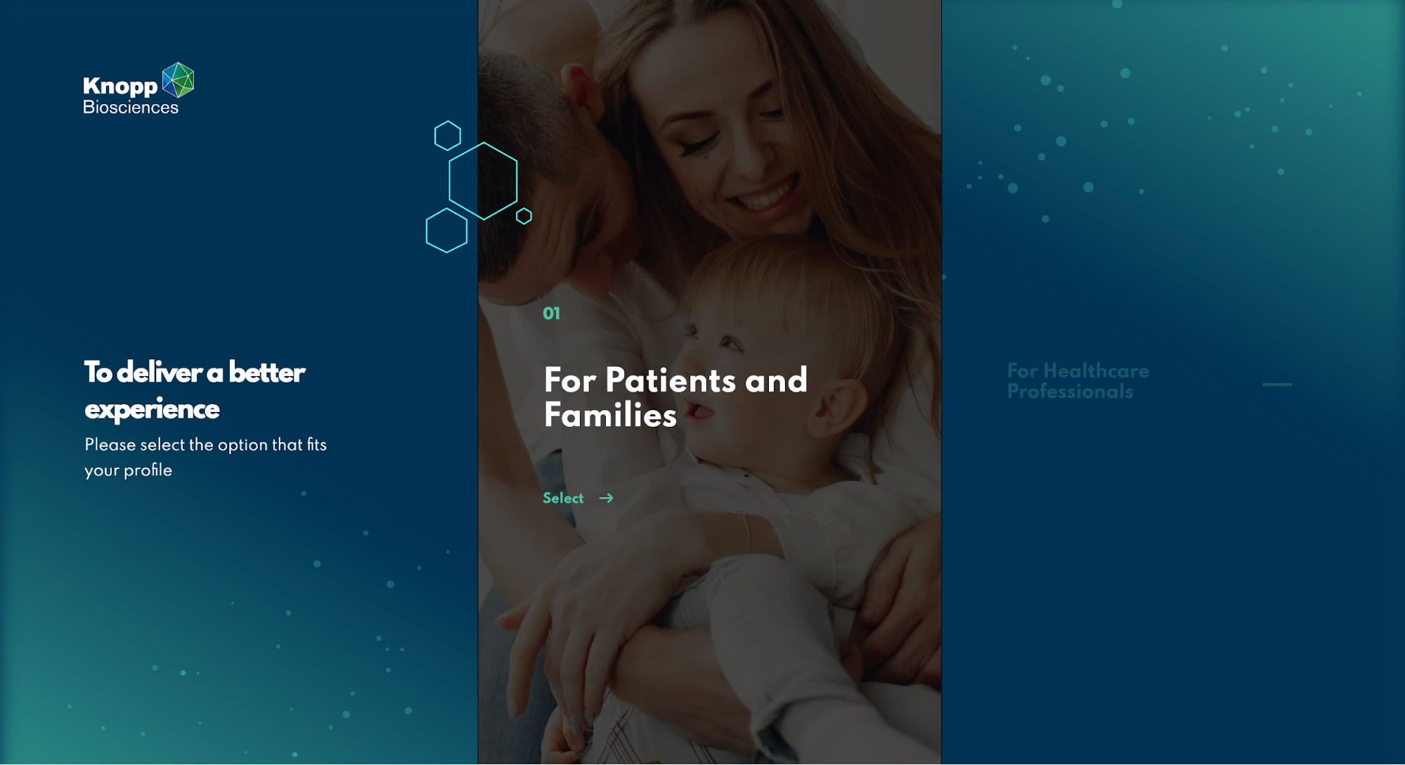
Knopp Bioscience website uses minimal, on-brand copy for a streamlined user journey
Make Content Scannable and Legible
Unless you’re writing long-form blogs (such as this one), make your web copy scannable, legible, and enjoyable to users.
We’re all overwhelmed with a sheer volume of information, both offline and online. An average user doesn’t have the patience or energy to carefully read through a huge block of text. And whatever some may say, it’s not a new trend. Even before the internet, most people would hastily glance over a couple of magazine covers, newspaper headlines and move on.
It’s the same with websites. The difference is, your audience isn’t a passive reader; they’re actively searching for pieces of information/specific unmet need/solution/service/product.
If they can comprehend what the page is about in six seconds or less, you’re really doing them and yourself a favor.
How would you know if you successfully formatted content to be scannable?
It’s fairly simple. If your users complete their desired tasks quickly and efficiently, if they make fewer mistakes on their journey and understand the structure and navigation and bounce rate is reduced – you did it. In order to achieve this, navigation will play a crucial role. Also, in order to improve the way your visitors navigate the blog, you would need to make use of WordPress categories and tags.
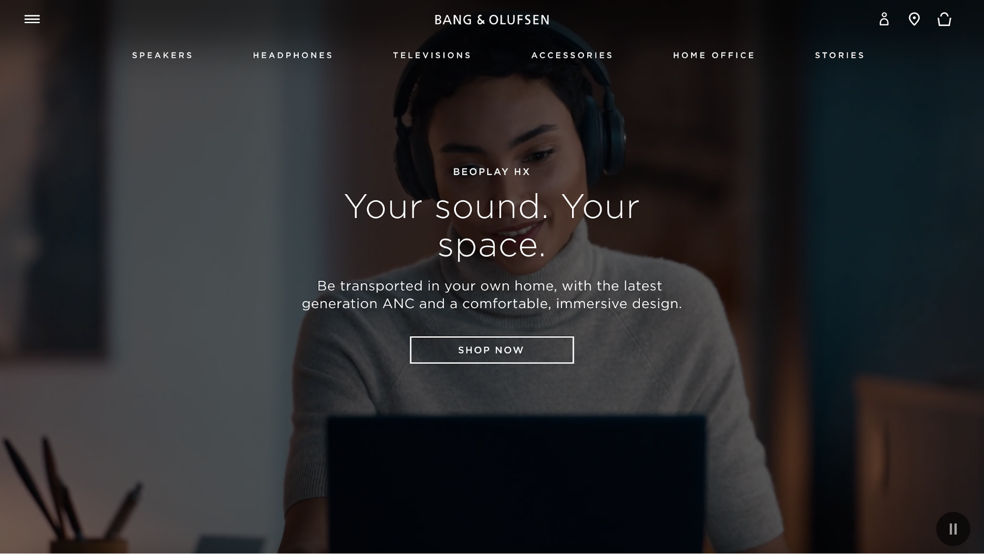
Bang & Olufsen presents its menu with one-word copy elements for legibility
Conclusion: The Benefits of a Good WordPress UX Design
These are the fundamentals, but that doesn’t mean you need to go over every single step to enhance your WordPress website’s UX. For some, eight tips are just not enough but remember that UX design is a never-ending process and it needs constant gardening.
When in doubt, always start from the first tip – proper research. Carefully determine your goals, what you want to change, having your users in mind. Before increasing that much-needed conversion rate, remember to provide an outstanding user experience.
If you nail all the tips listed, chances are, you’ll capitalize on them.