The Importance of Visual Context in Design Strategy

Designers know how important it is to create attention-grabbing visuals and use them to empower your design. Visual context is massively important when working on a design. It is the key to carrying out a successful presentation of information, content, brands, or businesses.
Visual context is what makes people stop and take a closer look. It’s what prevents them from scrolling away, exiting your Home page, and even turning to the competitors. If you’re not sure how visual context can improve your design strategy, just keep reading.
Let’s break down the importance of visual context in design strategy, together.
What is Visual Context?
The term visual context implies that you’re giving a deeper meaning to something. To put it simply, you’re putting it in context.
That means that the people you deliver this design to, won’t have to go through too much trouble in order to understand what you’re trying to say.
Designers use:
- images
- infographics
- icons
- shapes
These elements help them present the content and help the visitors grasp it faster. They convey messages, present information, give guidance, and trigger desired actions.
Visual context is essential for the proper placement of information, and we’re going to explain why.
1. Use the Power of First Impression
When people look for information online, they expect to find them quickly and easily. Nobody likes to spend too much time researching and reading to find what they’re looking for.
This is why, within seconds, people online make judgments and decisions about your brand and business, based on the design of your website.
In other words, your visual context can either make you or break you.
In terms of first impressions, visual context will:
- tell website visitors what your business is all about
- help them form the right opinion on you
- motivate them to stick around just a bit longer
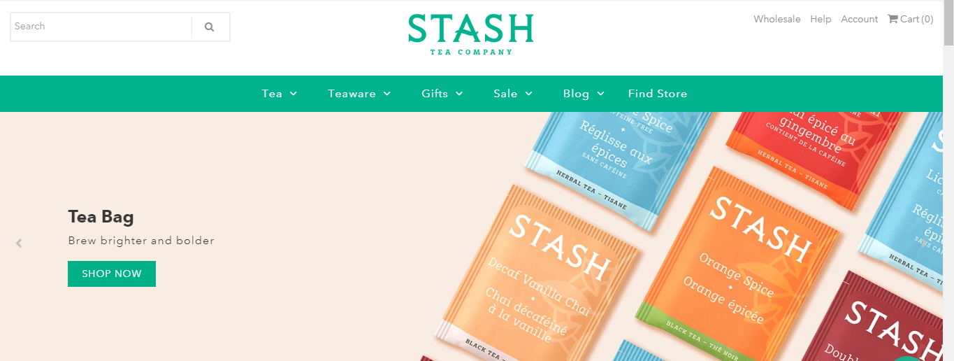
Let’s take a look at the home page of a tea company called Stash:

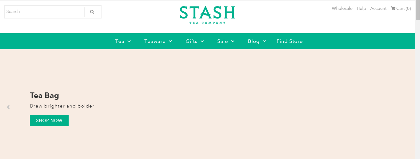
Now, imagine the visual context hasn’t been used:

You get the point, right?
2. Highlight Your Main Message
In business, it’s important to be straightforward. Business owners know that, and the designers know that.
This is why designers use visual context to reinforce the key messages of the business:
- who they are
- what they offer

source: Patch Plants
Visual context helps designers deliver the key messages of business and remove any doubt about it that the visitor may have had.
This saves everyone’s time. it also shows you’re trustworthy, professional, and straightforward.
3. Present Information
When working on your design strategy, you need to understand that people don’t like to read huge chunks of text in order to find the right information.
On the contrary, they want that information delivered straight to them.
Luckily, using visual context in your designs will help you deliver information quickly and clearly.
Let’s consider this example from the Ikea website:

These four pillows are completely different. Yet, just reading the description wouldn’t help you visualize each of them, and understand how different are they.
In this case, visual context provides information about the product such as:
- shape
- color
- size
- type
- model
So, visual context is about:
- presenting information
- not making your customers and visitors go through any trouble at all
Instead of making your customers read product descriptions, Ikea uses visual context to provide all information on the spot. It’s quick, convenient, and effective.
4. Tell Stories
Whether you’re running a small business or you’re the CEO of a major company, you need to understand that storytelling is important for raising brand awareness.
“Storytelling evokes emotions with your target audience. Creating emotional bonds with potential and current customers means bringing them a step closer to your business and working on establishing loyalty,” says Neightan White.

Source: Rainforest Foundation US
Images help:
- evoke emotions
- bring a story to life
- support facts and claims
Using visual context, you’re deepening the story you’re telling and you’re helping your target audience experience the emotions you’ve intended them to.
Images hit all the right buttons, instantly.
5. Generate Actions
In most cases, you’re working on a design with the goal of making people take certain actions.
Whether it’s buying a product, subscribing to your newsletter, or joining a webinar you’re hosting, the goal is to trigger actions.
By providing visual context to your CTAs you’re making them:
- more appealing
- more tempting
- more convincing
People need reassurance, and visual context will provide exactly that.

Source: Simple Green Smoothies
So, instead of talking your target audience into taking the desired actions, you can show them why they need to do it.
Just provide the right visual context, combine it with other marketing trends, and you’ll have a winning combination.
6. Be Memorable
Memorizing information is supported by creating a visual presentation of it.
This is why so many digital marketers turn to designers for help in making a brand, business, or product memorable.
When you link data and information to an image and give it a visual shape and form, you’re making sure it sticks. We can even say you’re making your content educational.

This makes your target audience:
- remember you
- find the information you’ve provided useful
- come back for more
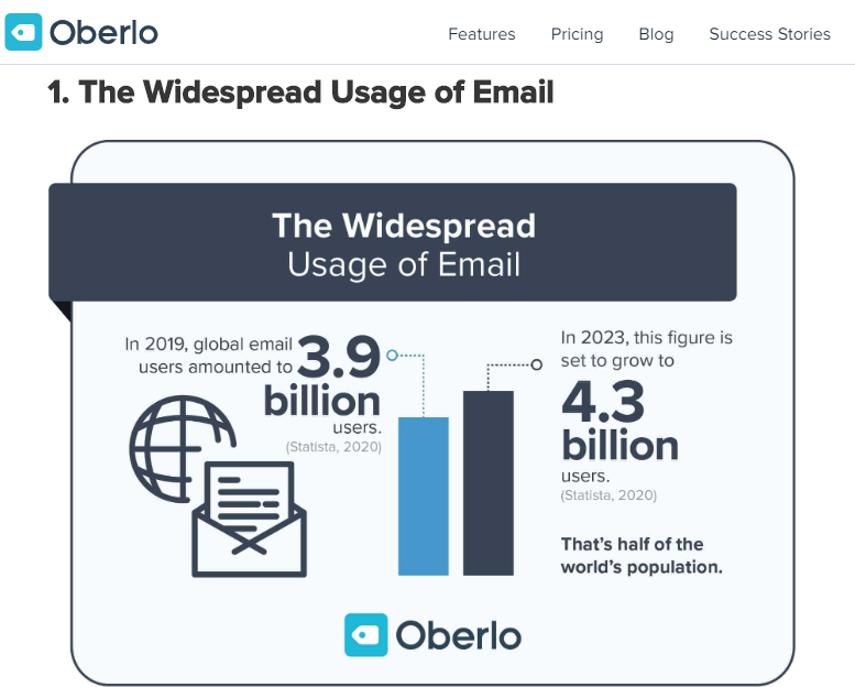
Infographics are the perfect example of how statistics, data, and other information can be presented in a more entertaining and effective manner.
When creating infographics, make sure you edit and proofread everything before publishing. Use Trust My Paper, Grab My Essay, or Studicus in case you need help with writing. If you need some inspiration, Visme has free infographic templates to help you with your design
Final Thoughts
A visual context is a powerful tool that designers count on when working on their design strategy. Visual context gives a deeper meaning to design, brings customers and businesses closer together, and reinforces everything that a business stands for.
This is why visual context needs to be a part of every designer’s design strategy.
About the Author: Kristin Savage nourishes, sparks and empowers using the magic of a word. Along with pursuing her degree in Creative Writing, Kristin was gaining experience in the publishing industry, with expertise in marketing strategy for publishers and authors. Now she works as a freelance writer at WowGrade and Bid For Writing. Kristin runs her own FlyWriting blog.